Opening with a cost question, not a pitch
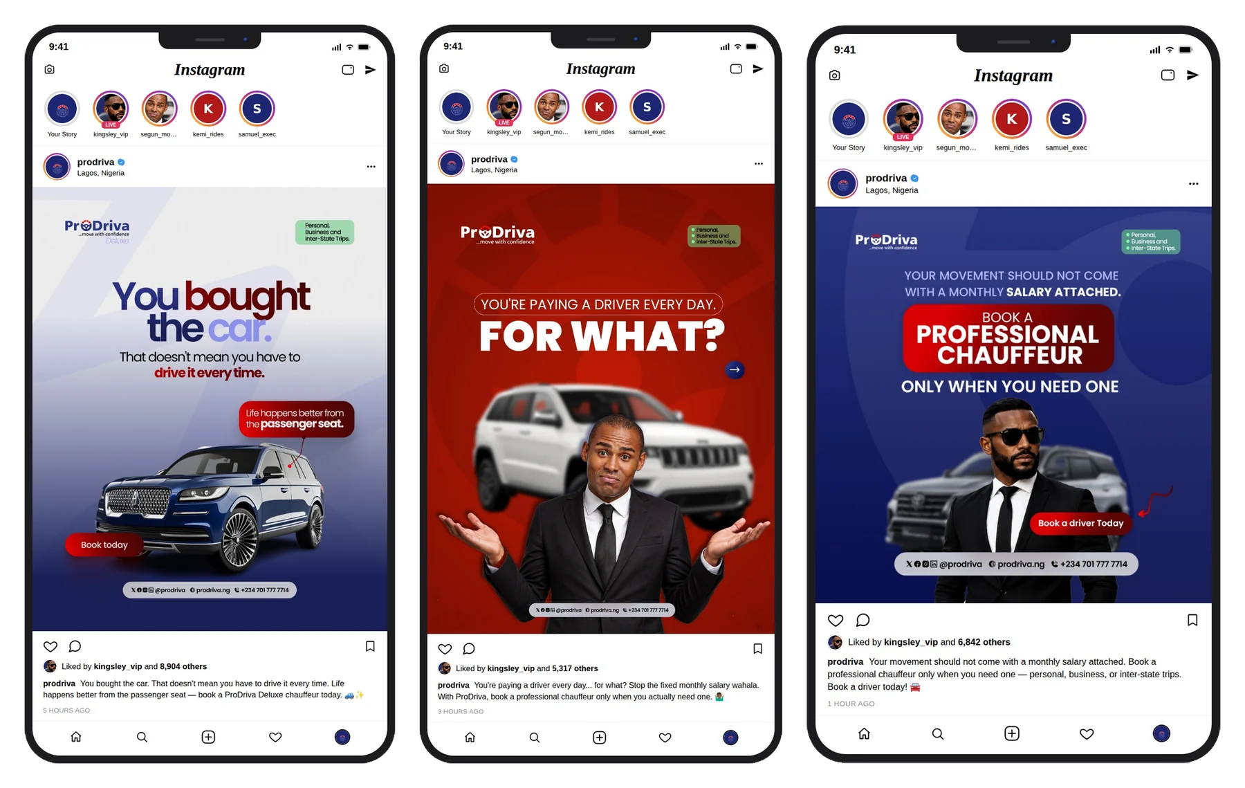
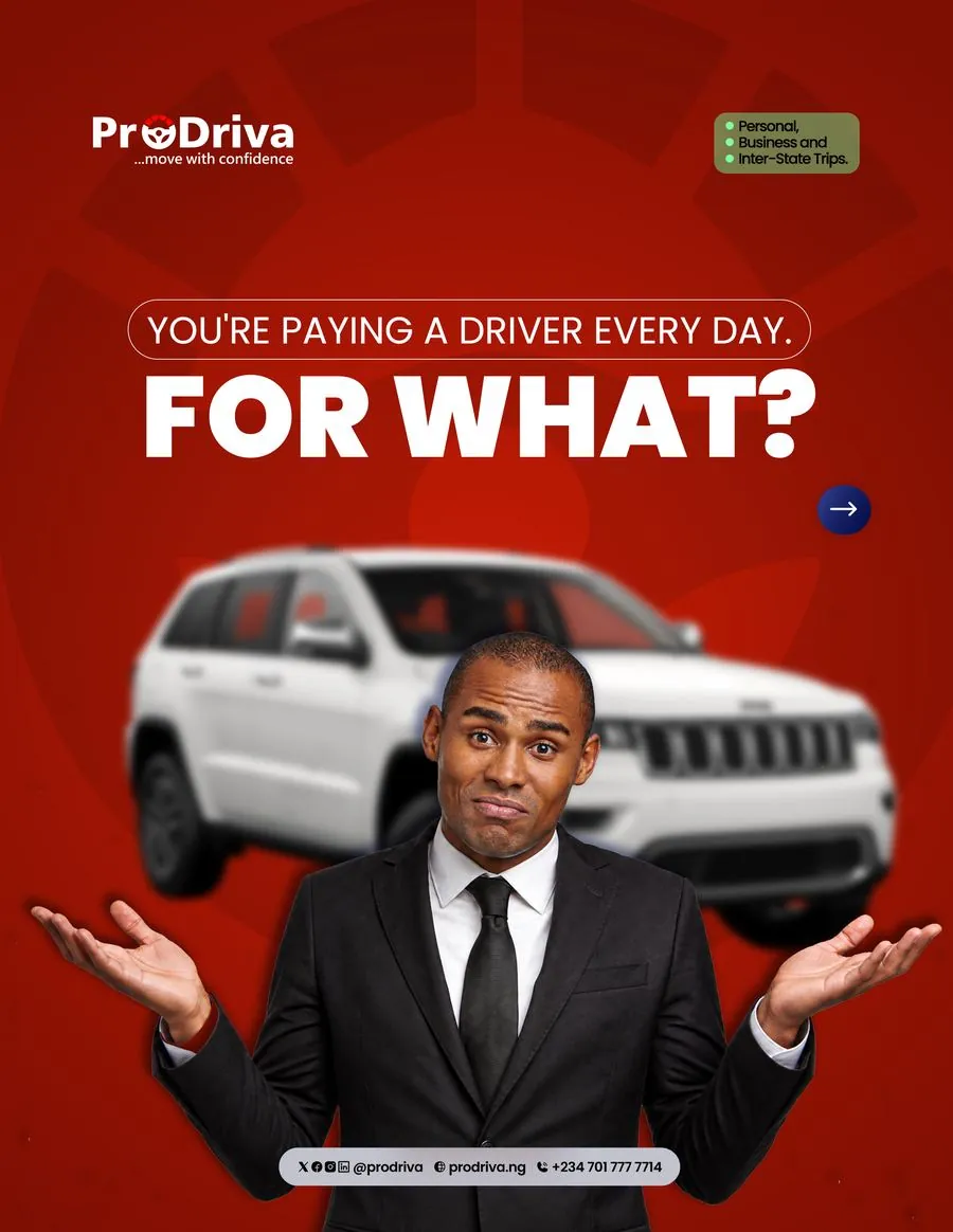
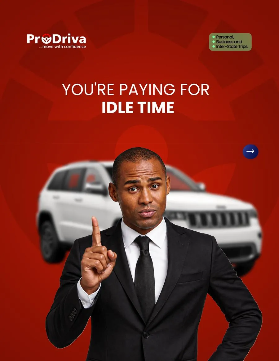
The first campaign never mentions ProDriva's features. It just asks the reader a question they haven't considered: why are you paying a full-time driver for time they spend doing nothing?
- "You're paying a driver every day. For what?" The hook, not the offer
- Facial expressions (confused, unconvinced) carry the emotional weight
- Swipe arrow keeps the carousel moving before the pitch even starts
Naming the real competitor: "driver"
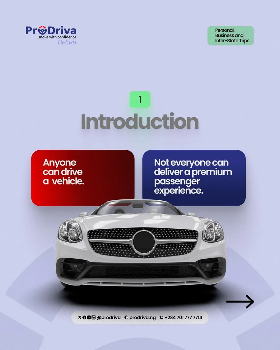
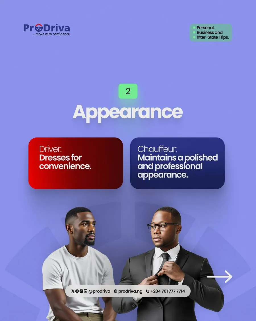
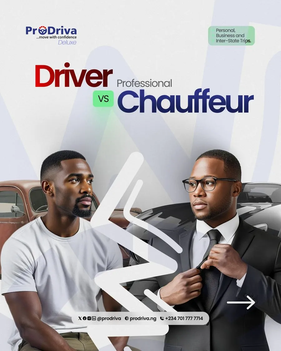
ProDriva isn't competing with other chauffeur apps, it's competing with the word "driver" itself. A 6-slide carousel draws a hard line between a driver and a professional chauffeur, redefining the category before asking for the booking.
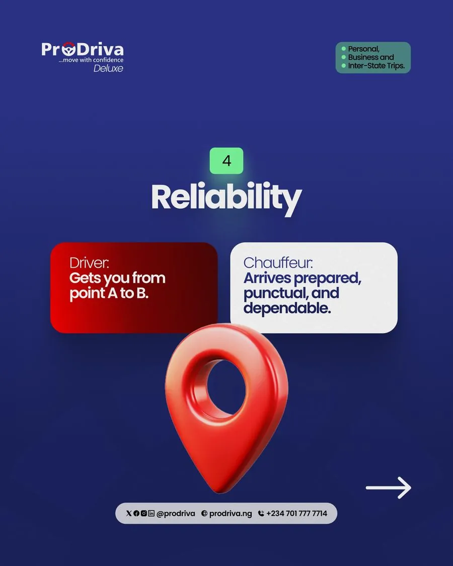
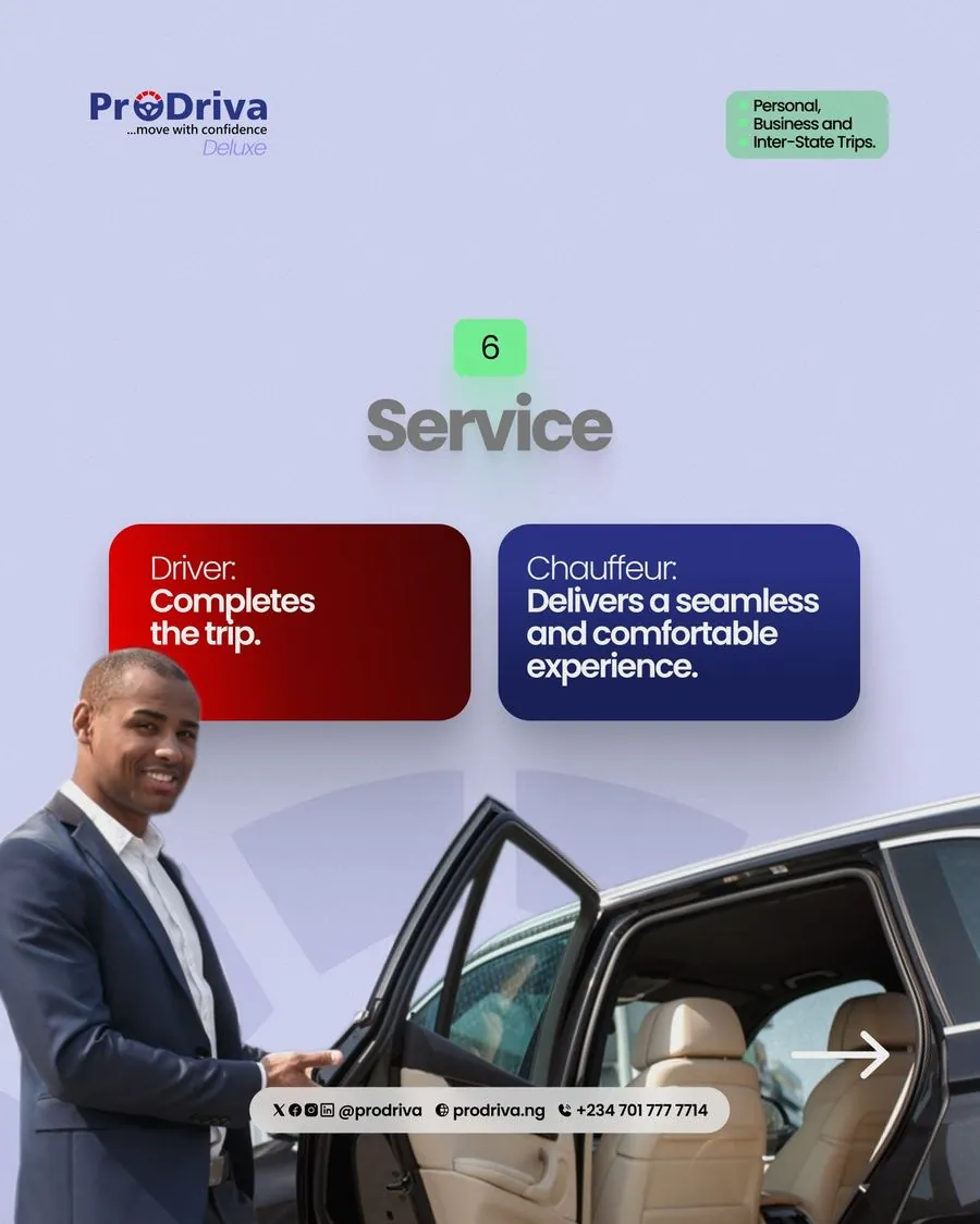
- Red card = driver, blue card = chauffeur, every single slide
- Six categories compared: Introduction, Appearance, Attitude, Reliability, Safety, Service
- Numbered green badge tracks progress through the carousel
One comparison template, six categories
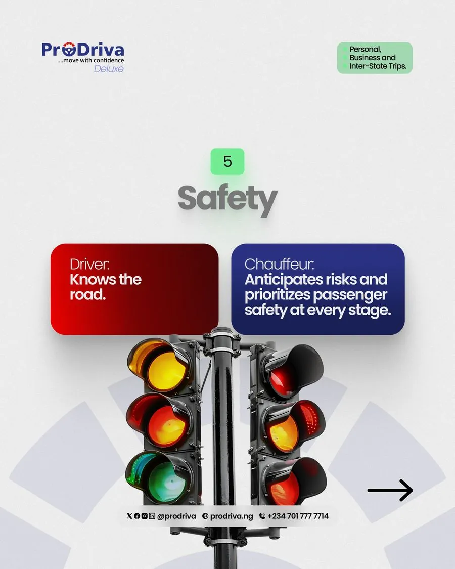
Every slide in the comparison follows the same locked structure, category name, red "Driver" card on the left, blue "Chauffeur" card on the right, a supporting photo below. The reader learns the pattern by slide two and can then skim the rest fast.
- Consistent card colors: red always driver, blue always chauffeur
- Short category headline (Reliability, Safety, Service) anchors each slide
- Photo choice reinforces the words, a traffic light for "Safety," a car door held open for "Service"
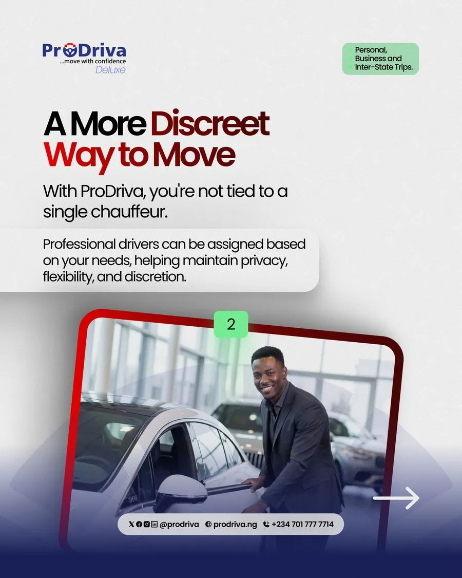
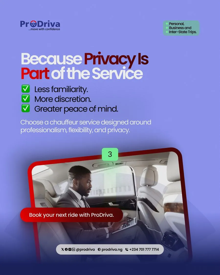
Selling privacy to the premium buyer
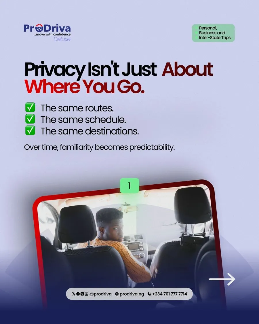
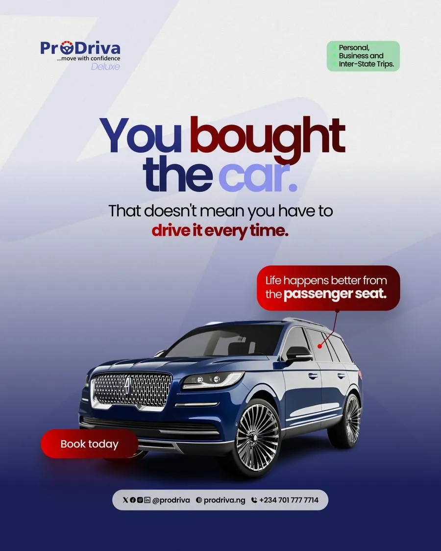
The Deluxe tier needed a different argument entirely, not cost or convenience, but privacy. A daily driver learns your routine; ProDriva's rotating chauffeurs don't. A separate single post reframed a personal car itself: "life happens better from the passenger seat."
- Lavender/purple palette signals a calmer, higher-tier product
- "You bought the car" post reframes car ownership, not driving cost
Closing with a direct, low-friction CTA
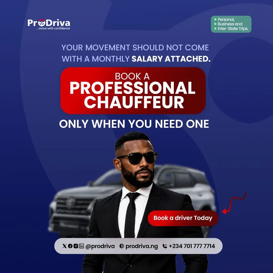
After the education and the emotional hook, the close stays simple: one bold red button, one arrow pointing at it, one line of copy. No further persuasion needed by that point.
- "Book a Driver Today", always the same button style, red on dark blue
- Hand-drawn arrow points straight at the CTA, every time
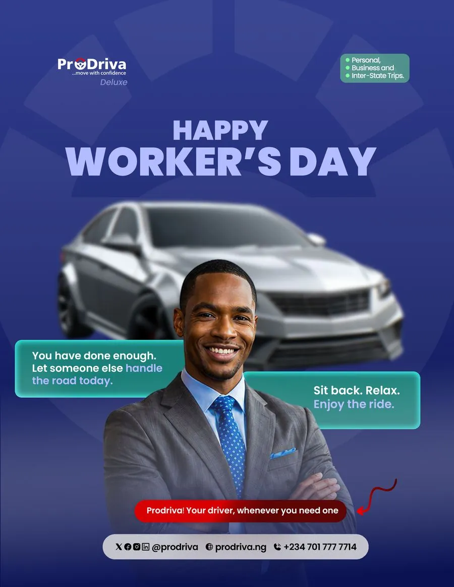
- Seasonal moments (Worker's Day) still end on the same booking prompt