← Back to Work
Case Study

Giving Dunn and Braxton a look people recognize instantly

Dunn and Braxton help businesses hire the right people. As their embedded design partner, I handle their social posts on a monthly cadence, so every single one, no matter the topic, looks like it belongs to the same brand.

What I Did
Social Media Graphics
For
Dunn and Braxton
How Often
Ongoing, Every Month
Step 1

Picked colors and a style that mean "trust"

Dunn and Braxton is a serious business brand, not a fun consumer app. So I kept it simple: blue and red on a clean white background, real photos, no clutter.

  • Blue = calm and trustworthy
  • Red = highlights the important line
  • Same logo placement on every single post
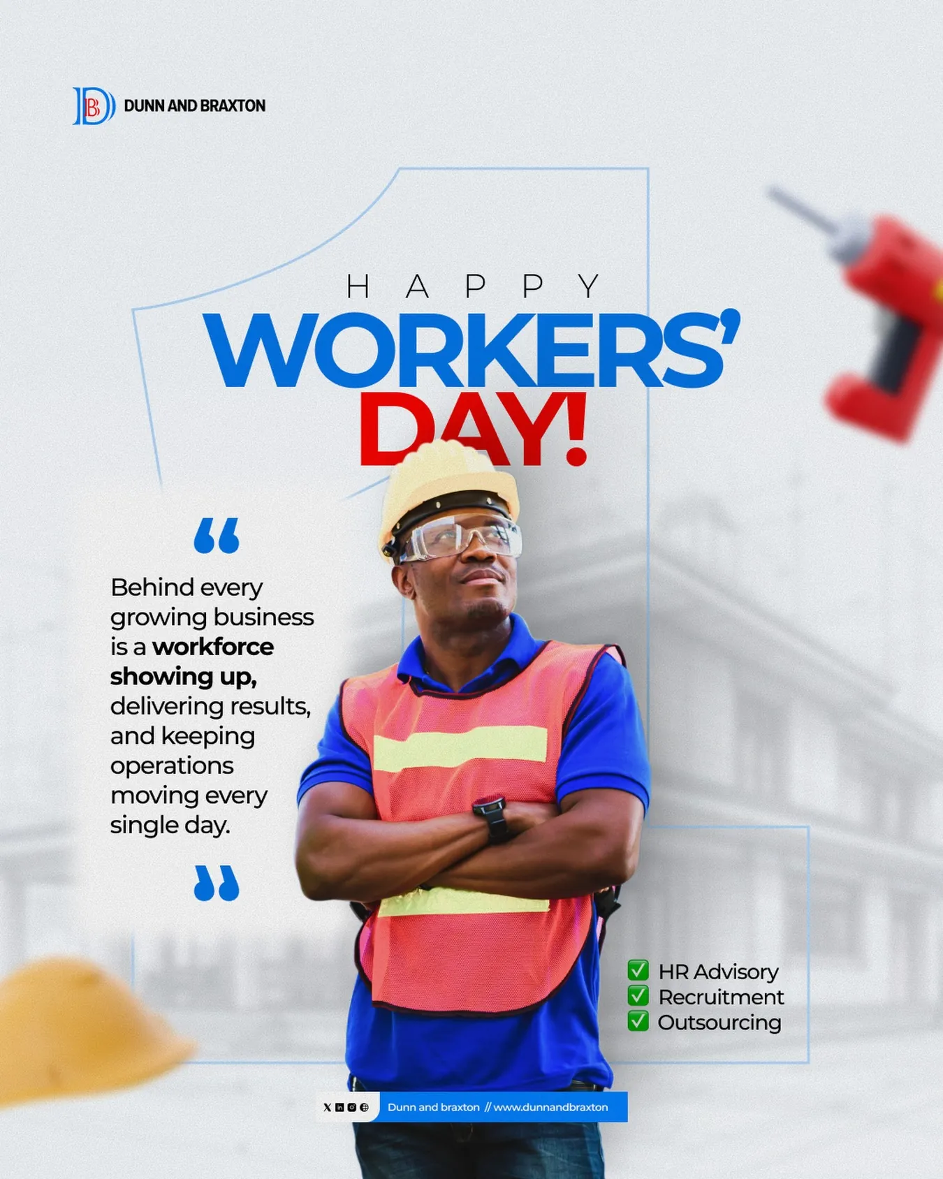
Happy Workers Day post
Even a holiday post still looks unmistakably Dunn and Braxton

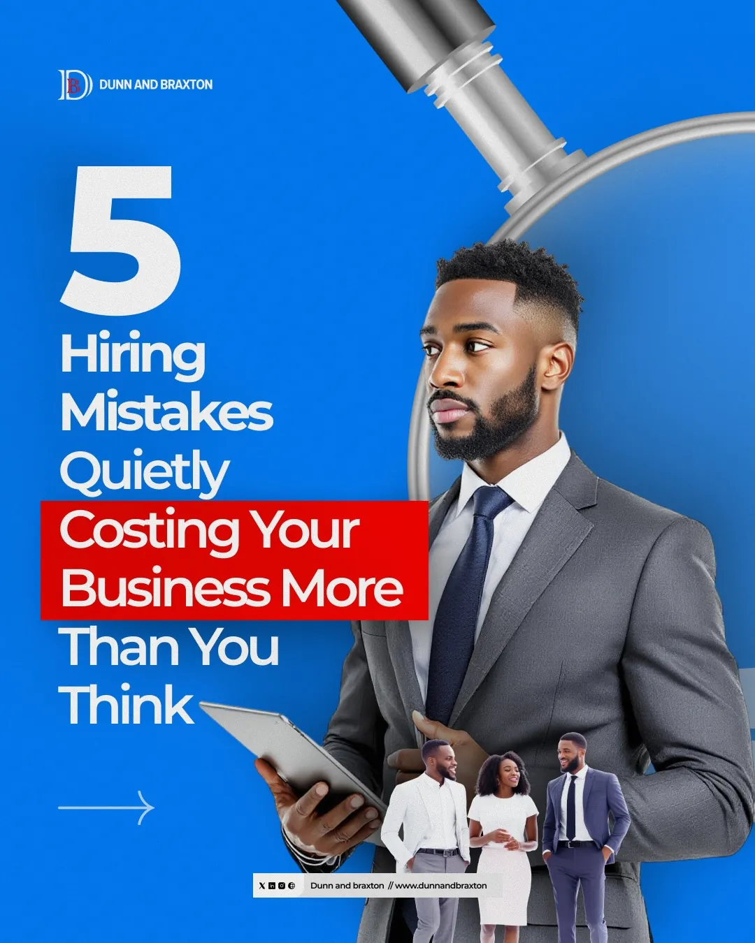
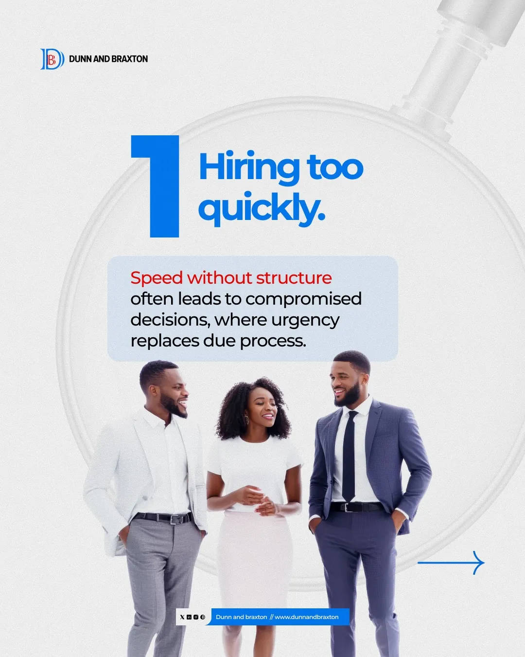
5 Hiring Mistakes cover slide Hiring too quickly slide
The same layout, reused for every slide in the series
Step 2

Built one template, used it again and again

Instead of designing every slide from scratch, I made one reusable layout: big number, short headline, one photo. This saves time and keeps things consistent.

  • Faster to produce new posts
  • Easy for people to recognize as they scroll

Step 3

Used it for a full 7-slide series

"5 Hiring Mistakes" walks people through common hiring problems, one slide at a time, ending with a call to action.

  • Hiring too fast
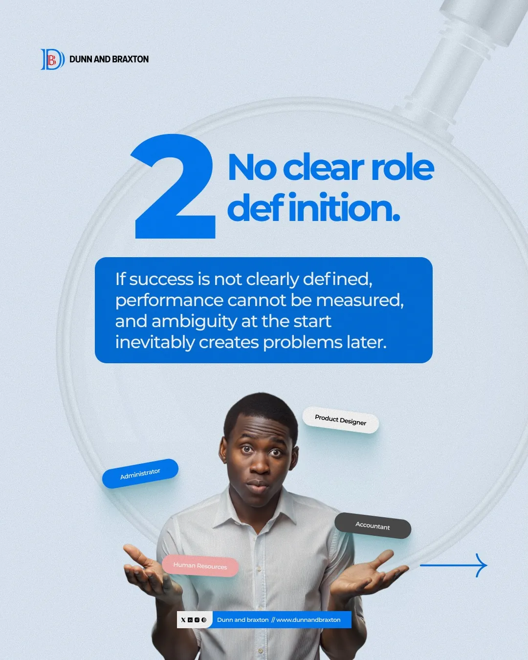
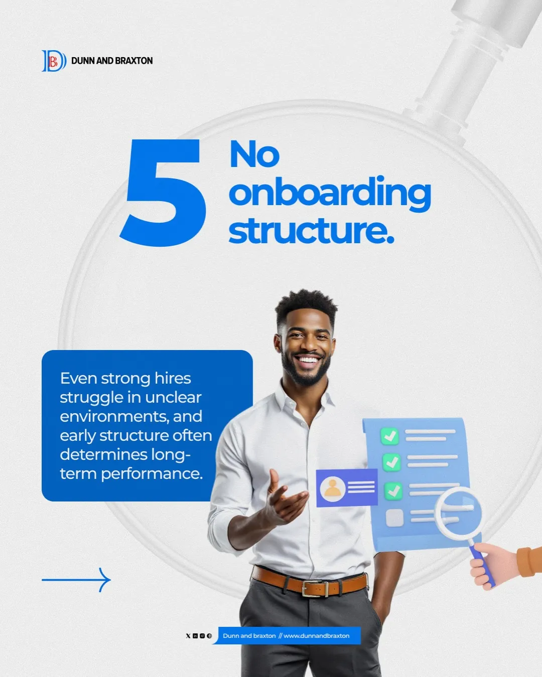
  • No clear job description
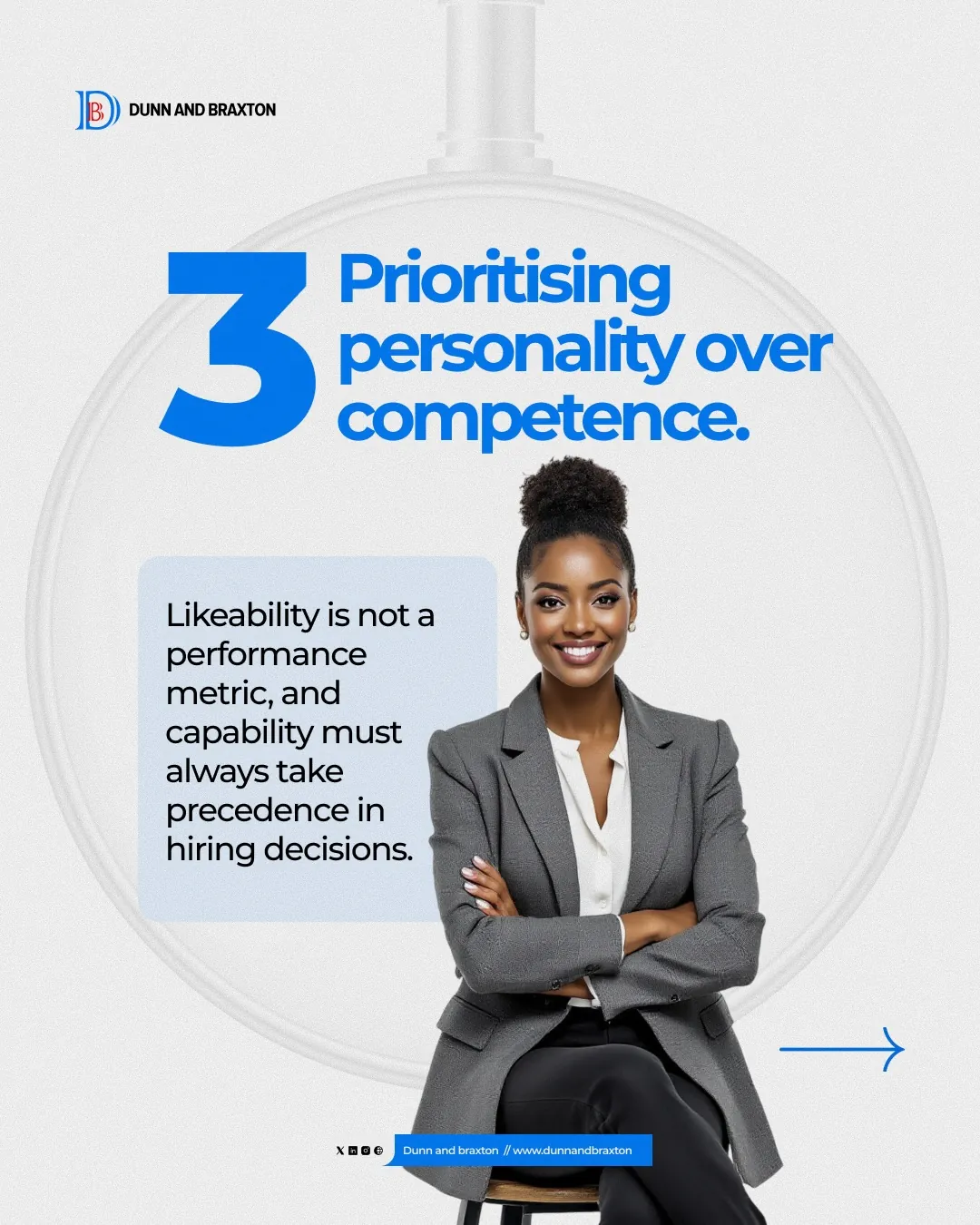
  • Picking personality over skill
  • No onboarding plan
No clear role definition slide Personality over competence slide No onboarding structure slide
Same look, five different points

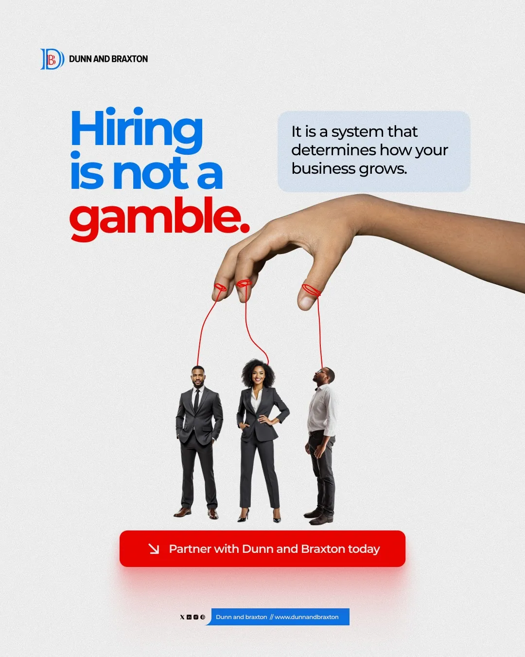
Hiring is not a gamble closing slide
The final slide always tells people what to do next
Step 4

Every series ends with a clear next step

No post ends without telling the reader what to do. Here, a simple red button says "Partner with Dunn and Braxton today."


Step 5

Made shorter posts for quick ideas

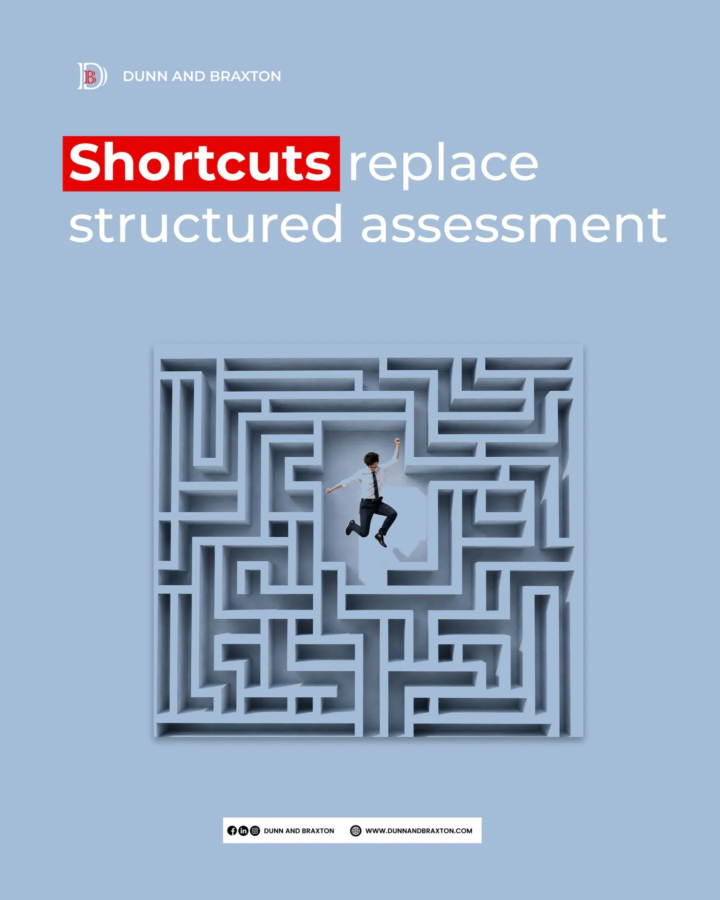
Not every idea needs a full slideshow. For quick, punchy thoughts, I used one bold statement and one image,nothing else needed.
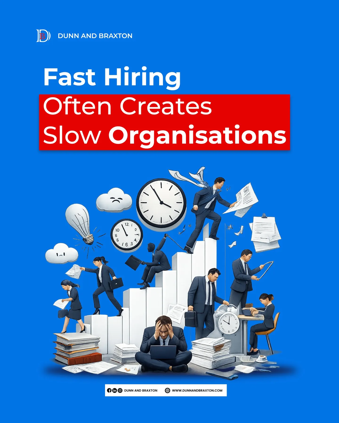
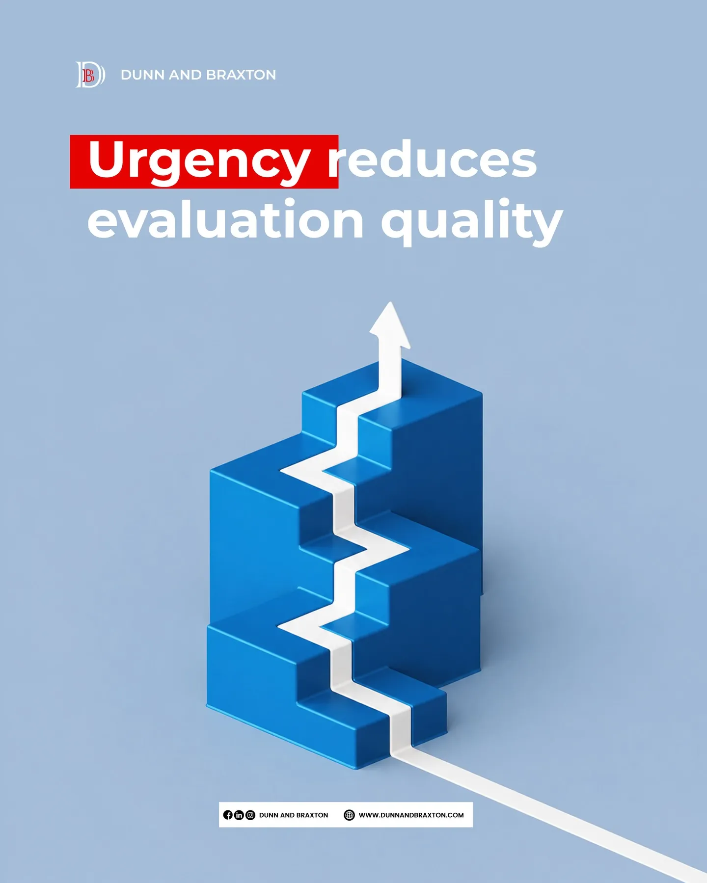
Fast hiring creates slow organisations Urgency reduces evaluation quality Shortcuts replace structured assessment
Quick, one-idea posts,same colors, less clutter

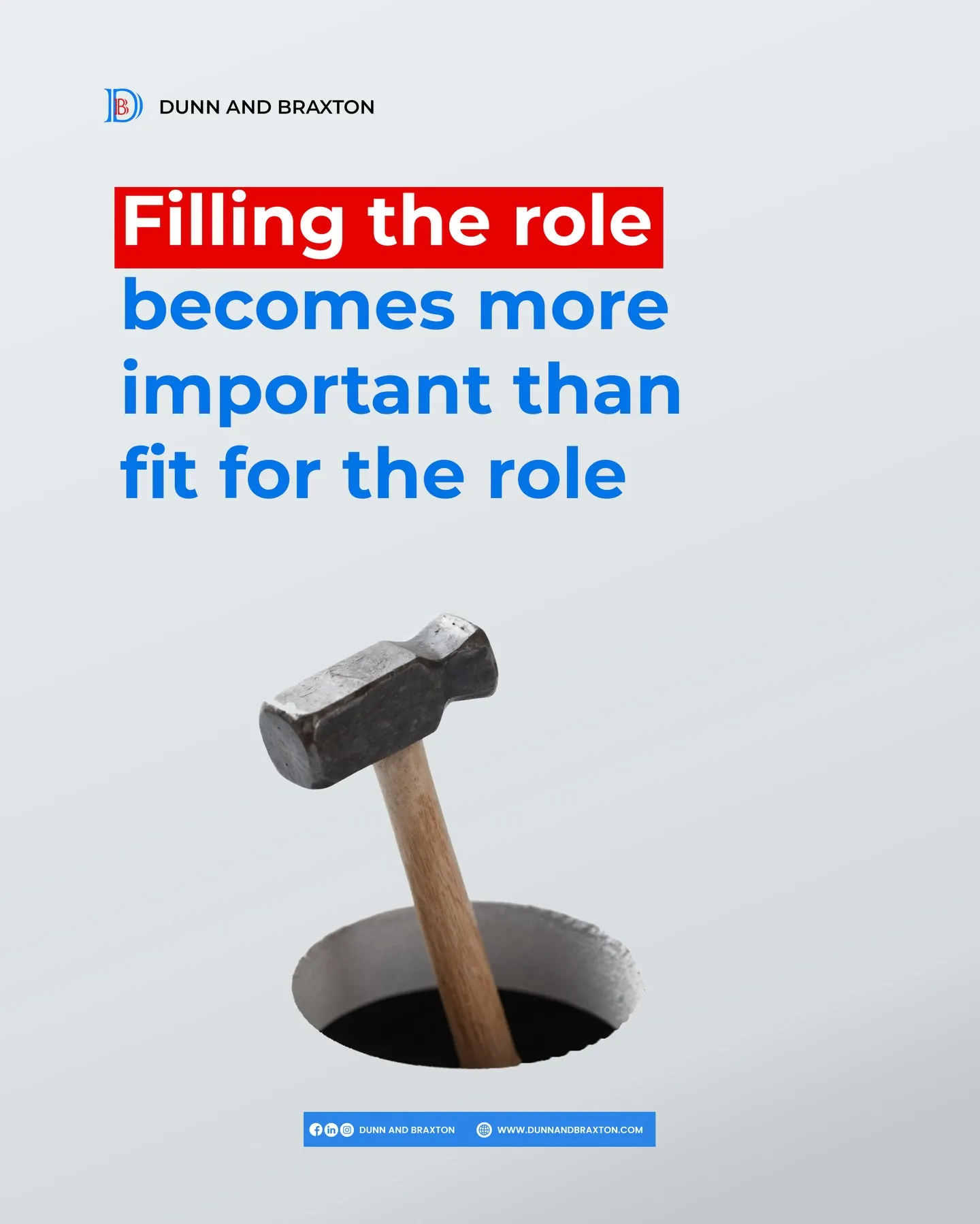
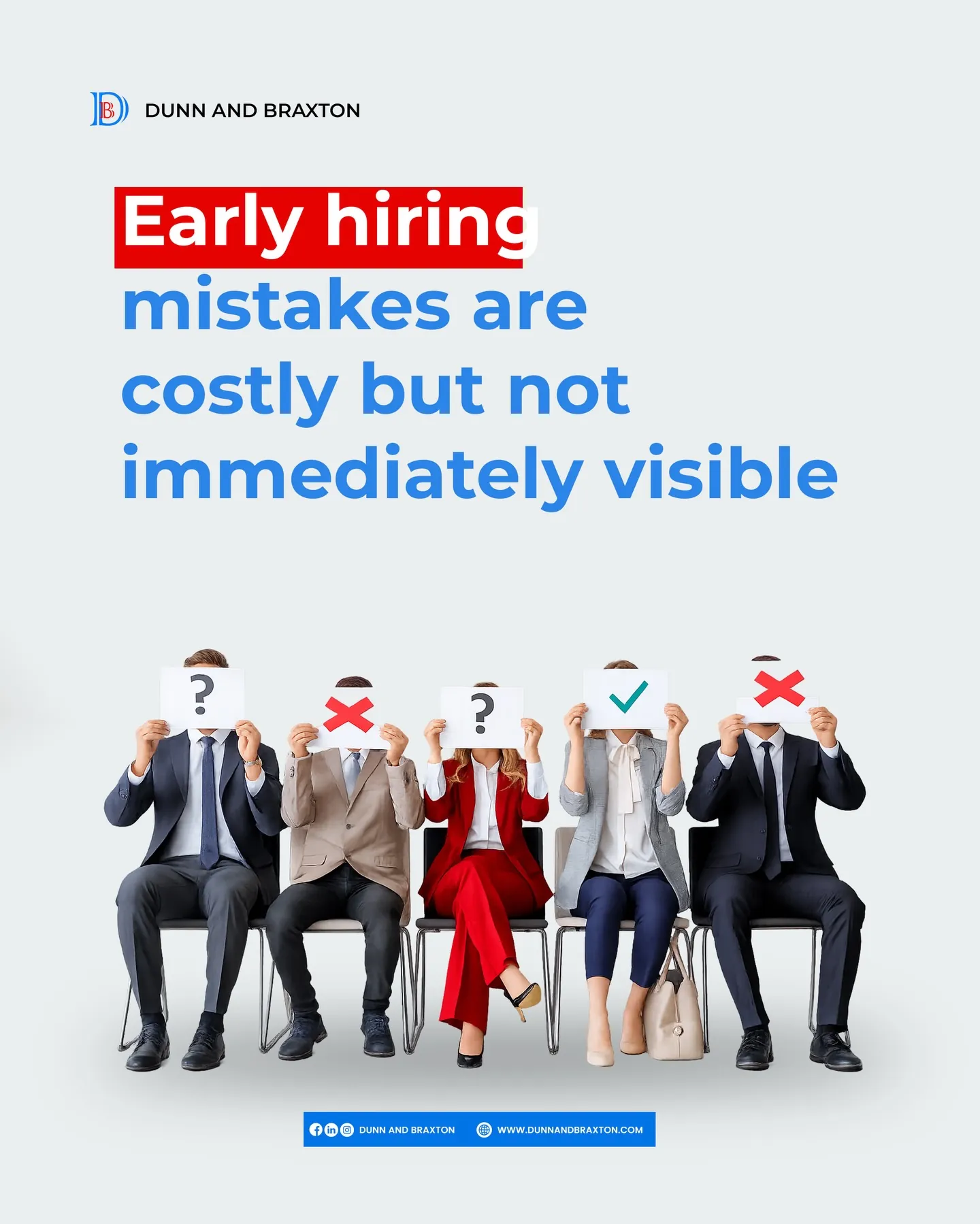
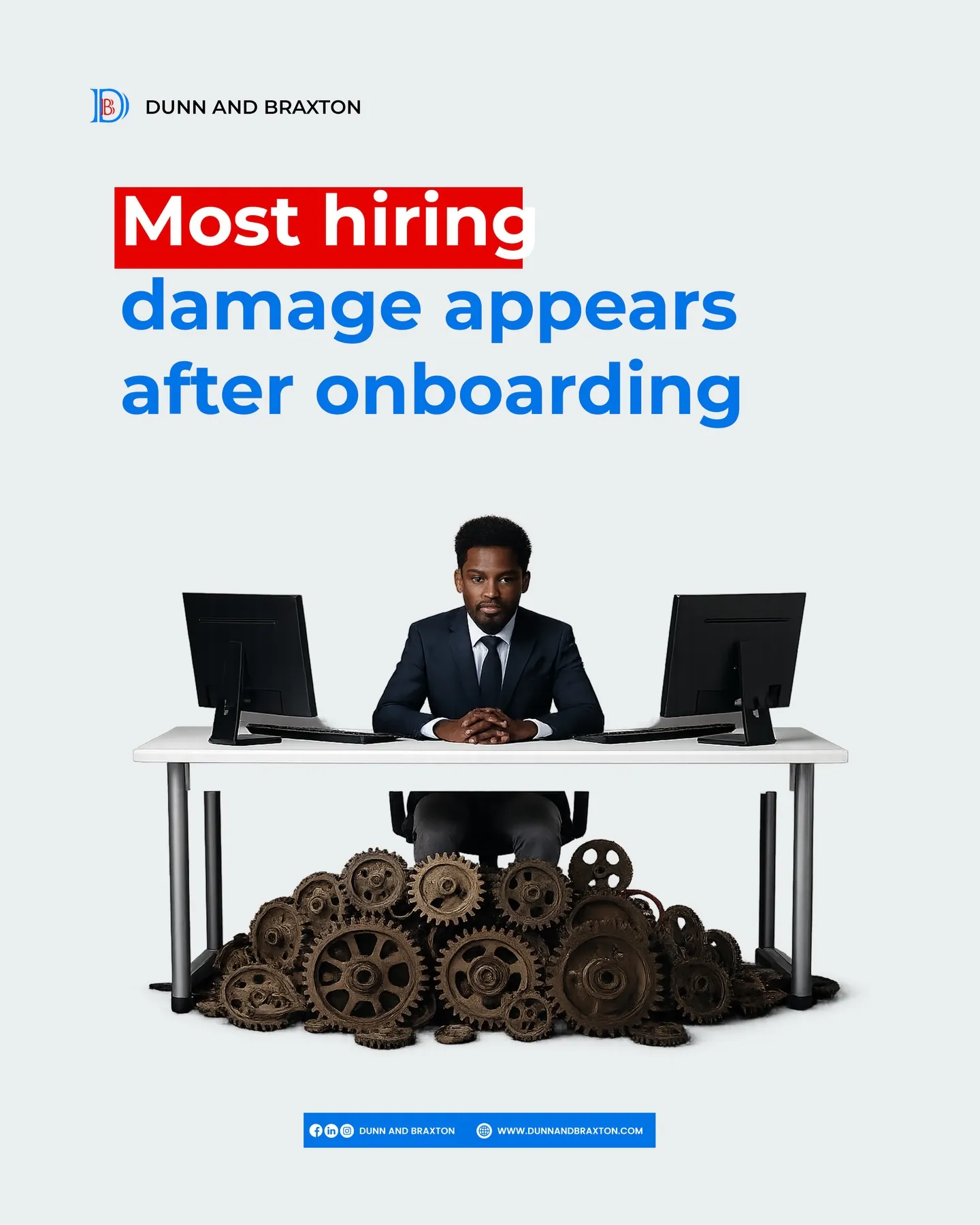
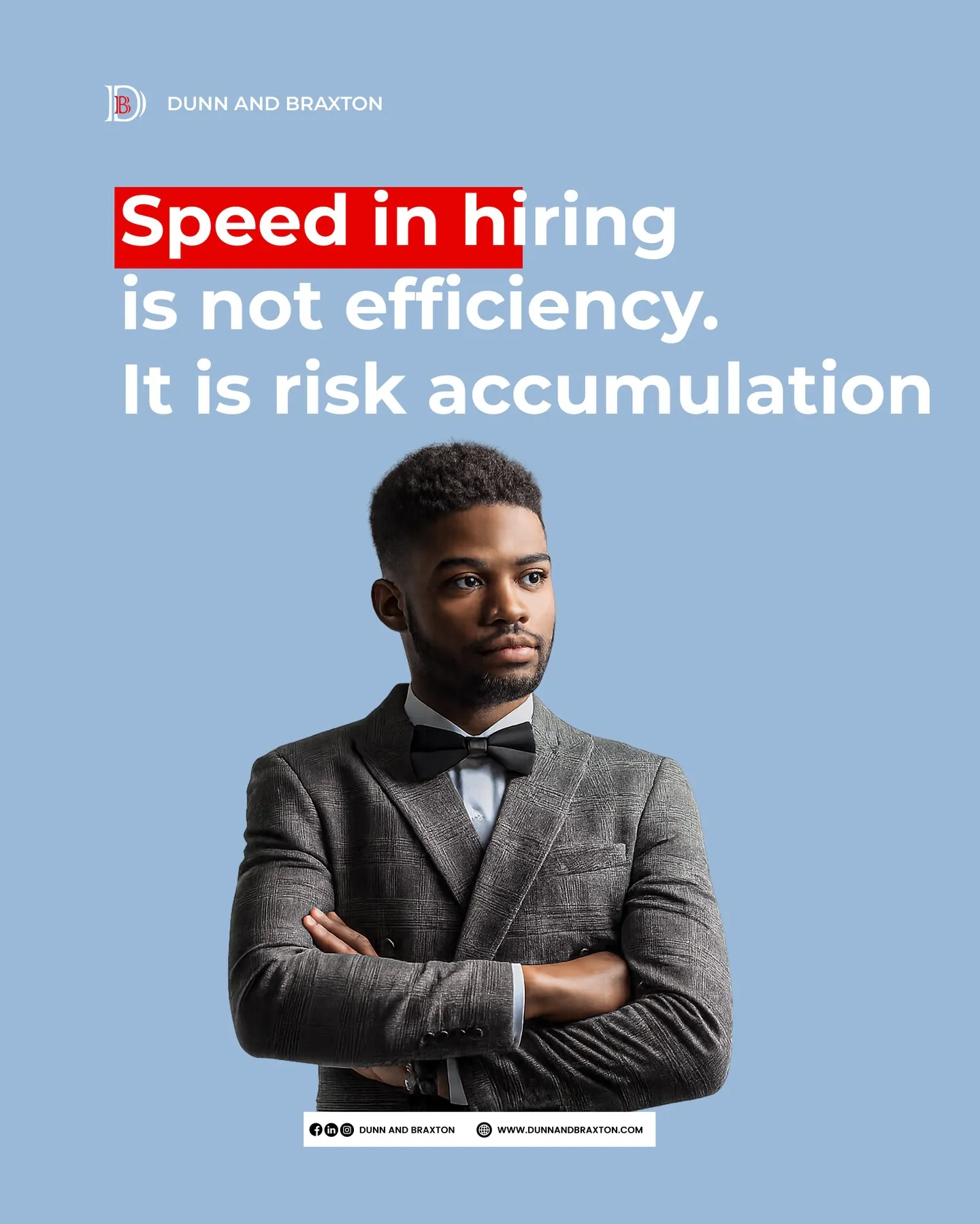
Filling the role vs fit for the role Early hiring mistakes are costly Damage appears after onboarding Speed in hiring is risk
More quick-idea posts, all sharing the same style
Step 6

Kept it consistent, even with simple ideas

A hammer, a maze, gears,simple images that make a hiring idea easy to understand at a glance, without needing to read every word.


Step 7

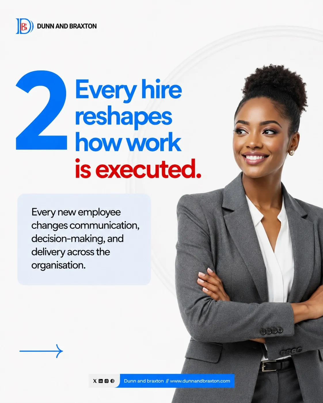
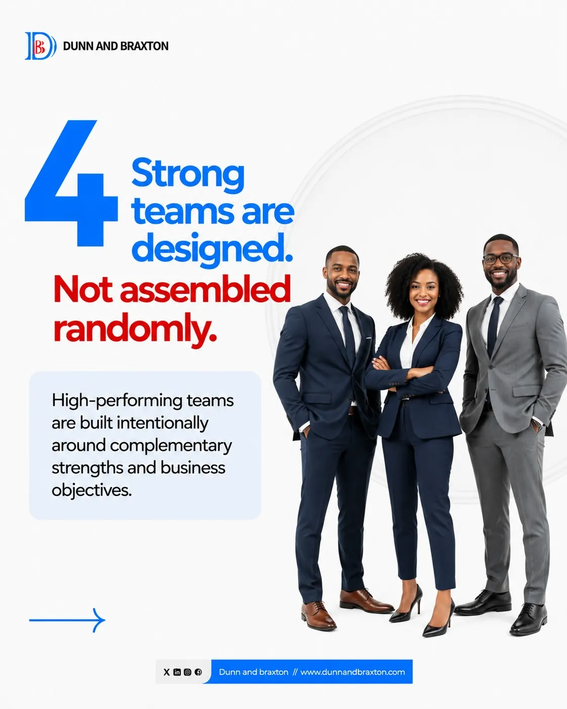
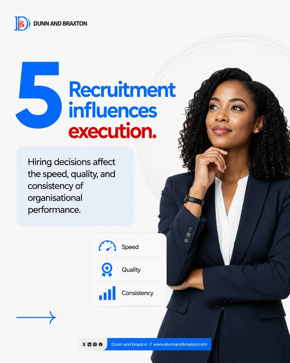
Reused the template for a second series

"Hiring is Infrastructure" used the exact same layout from Step 2. Proof the system works for any new topic, not just one campaign.
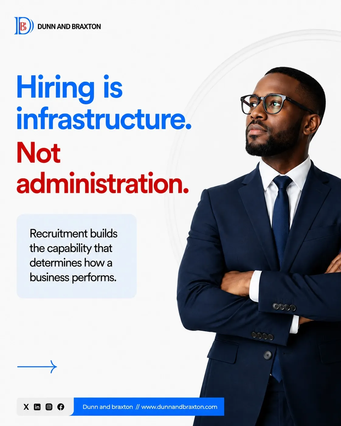
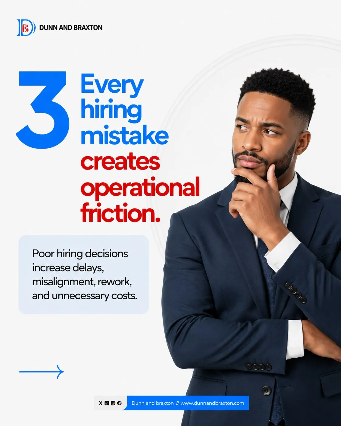
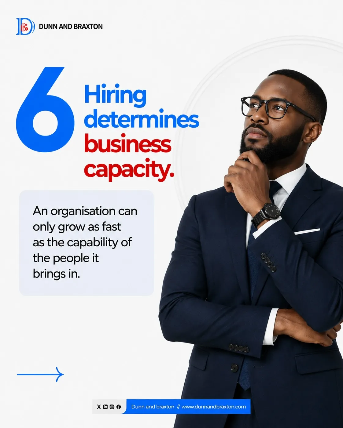
Hiring is infrastructure cover slide Every hiring mistake creates friction slide Hiring determines business capacity slide
New topic, same trusted look
Happy Workers Day post 5 Hiring Mistakes cover Hiring too quickly No clear role definition Personality over competence No onboarding structure Hiring is not a gamble Fast hiring creates slow organisations Urgency reduces evaluation quality Shortcuts replace structured assessment Filling the role vs fit for the role Early hiring mistakes are costly Damage appears after onboarding Speed in hiring is risk Hiring is infrastructure cover Every hire reshapes execution Every hiring mistake creates friction Strong teams are designed Recruitment influences execution Hiring determines business capacity

Ready to remove design as a bottleneck?

More creative capacity. Faster execution. No full-time hire.

Book a Free Strategy Call